Everyone remembers first impressions. Make good ones.
Because our logos are often the first impression we make on people, they should always be presented properly and consistently. This section covers the different logos, how to use them, how not to use them, and steps to fix improperly-used logos.
Stepworks

Full Lockup
Icon
Program Specific Lockups

Wordmark
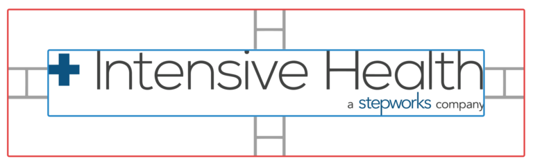
Intensive Health
Full Lockup
Icon
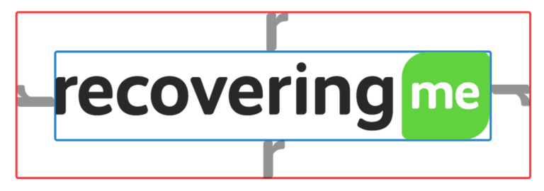
Recovering(me)
Full Lockup
Icon
How to Use
Spacing and Placement
Stepworks
When used alone, the spacing between the icon and other objects should be equal to the height of the icon
Branding elements should always be placed where they are easy-to-read. If placed over a background image, they should remain easy-to-read at a glance.
Intensive Health
The margins around the Intensive Health logo is determined by the height of the “H.”
While the Intensive Health logo has two versions–light and dark–the dark version is preferred in almost every case. However, the inverted icon is acceptable when required by the design.
The icon should be spaced based on height.
The icon should not stand alone to identify Intensive Health. If the full logo has not been introduced to the viewer elsewhere in the document, the full logo should be chosen over the stand alone “+” icon. Treat the icon as an acronym. If the full brand has not been defined, the icon has no meaning and should not be used in place of the full logo.
Recovering(me)
The margins required around the Recovering(me) logo are determined by the height of the “r.”
The full logo should be used in most cases, but the icon alone can be used as needed. Again, think of the icon as an acronym for the full logo. It should only be used when the viewer has already been introduced to the full logo and name of the brand. So the icon should not stand alone to represent the brand in most cases.
The icon should be spaced based on height.
Logo Variations
Most of the logos have variations for use in different situations. These come in the form of light and dark versions. When choosing which one to use, always pick the one that is more prominent visually.
What Not to Do
The following are transformations you should never make to the logo.
Do not modify the logo in any way apart from uniformly scaling. Do not stretch, rotate, mask, or change the color.
Do not change the relative size or color of elements in a lockup.

Exceptions
Exceptions are extremely rare and must be approved by the Creative Director or CEO.
What to Do if You Find a Design Breaking these Guidelines
Take responsibility for any defects you find.
If you come across a document not abiding by these standards, address the issue as soon as possible. Fill out a media request on Stepworks University for a document design update.